
Adventures in Lilla Land
Hello friends...
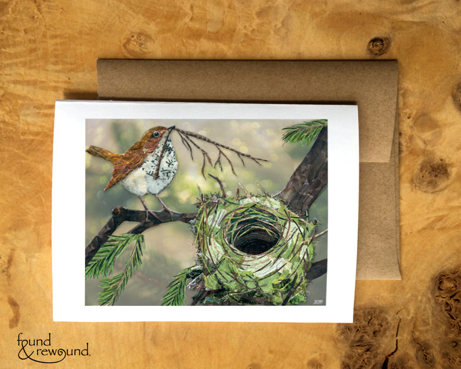
Here I am in my second week of Lilla Rogers' Make Art That Sells (MATS) Part B. After taking MATS and Bootcamp with Lilla, I feel like I'm starting to anticipate what she's going to say and do - it's a tad scary/weird. That said, I have to say all of my adventures in "Lilla Land" are helping me build a pretty big selection of artwork. There's only one drawback...I have lots of singles, onesies, and solo bits of this and that. In other words, I have one fully developed piece for each theme or market. And I'd really like to work on building collections. So I've been trying to be really conscious about that and make lots of drawings that I can come back to and build on.
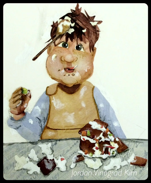
So the first week of class our assignment was focused on the paper goods market. We were asked to develop a holiday greeting card in the theme of gingerbread houses. I took a pretty different approach, inspired by what I imagined might happen if I were to give our little man the opportunity to build a gingerbread house. Here's how it started...
 It's hard to tell in this photo, but I started with a sketch and then started doing paper collage over the top. Yep, it's all paper at this point. I used advertisements mostly - model's hair for his hair, the blue sleeves are from an old National Geographic magazine photo of elk in the fog, his bib's tan/mustard color is the background from a medicine advertisement, etc.
And here's where he ended up...
It's hard to tell in this photo, but I started with a sketch and then started doing paper collage over the top. Yep, it's all paper at this point. I used advertisements mostly - model's hair for his hair, the blue sleeves are from an old National Geographic magazine photo of elk in the fog, his bib's tan/mustard color is the background from a medicine advertisement, etc.
And here's where he ended up...
 I used a sentiment that said "Wishing you a merry, with a dash of messy". I wasn't totally satisfied with how the final card mock up came out, but I really like the idea of looking for the merriment in the midst of the messiness that is always part of the holidays. Finding the joy in the messy ordinary moments. I don't think this will be the last time I look at this piece, so it's a fun one to have in my stash to come back to.
I learned a couple of great lessons last week -
I need to be a lot more conscious of using a limited color palette, especially for licensing. It's hard to do when you're using things like magazines and junk mail, but I think I need to be more disciplined about that. I've always just used the colors that came on the materials that inspired me, but not been really deliberate about the tone they create in the final piece. I'm thinking lots more about color these days.
People don't generally see that I am making paper collages. This is not a new lesson, but one that I would like to figure out how to demonstrate more since I think it is what makes my art unique and defines my style. A friend once told me that I paint with paper. I guess that's the best way to describe it. When I did a lot of shows, people would often comment about my "paintings" and I would have to explain that they are make up of tiny bits of paper. People would scratch their heads and I'd take them up real close so I could point out strands of hair from shampoo ads and red stripes from a Starburst wrapper. Then people would really get excited about my work. Unfortunately, I don't get the chance to do that with folks that just see my work online or that I submit to a potential client. So I have been trying to make the collage component more "obvious" - inserting bits of text here and there, or trying NOT to get the colors or lines to match up perfectly between two bits of paper. I'd welcome any ideas or suggestions you might have on how best to help people see the collage for what it is. Please leave them in the comments below!
Now onto week 2 - we've already got our theme....(Think "Y'arrr matie!") Check back next week for some more adventures in Lilla Land.
I used a sentiment that said "Wishing you a merry, with a dash of messy". I wasn't totally satisfied with how the final card mock up came out, but I really like the idea of looking for the merriment in the midst of the messiness that is always part of the holidays. Finding the joy in the messy ordinary moments. I don't think this will be the last time I look at this piece, so it's a fun one to have in my stash to come back to.
I learned a couple of great lessons last week -
I need to be a lot more conscious of using a limited color palette, especially for licensing. It's hard to do when you're using things like magazines and junk mail, but I think I need to be more disciplined about that. I've always just used the colors that came on the materials that inspired me, but not been really deliberate about the tone they create in the final piece. I'm thinking lots more about color these days.
People don't generally see that I am making paper collages. This is not a new lesson, but one that I would like to figure out how to demonstrate more since I think it is what makes my art unique and defines my style. A friend once told me that I paint with paper. I guess that's the best way to describe it. When I did a lot of shows, people would often comment about my "paintings" and I would have to explain that they are make up of tiny bits of paper. People would scratch their heads and I'd take them up real close so I could point out strands of hair from shampoo ads and red stripes from a Starburst wrapper. Then people would really get excited about my work. Unfortunately, I don't get the chance to do that with folks that just see my work online or that I submit to a potential client. So I have been trying to make the collage component more "obvious" - inserting bits of text here and there, or trying NOT to get the colors or lines to match up perfectly between two bits of paper. I'd welcome any ideas or suggestions you might have on how best to help people see the collage for what it is. Please leave them in the comments below!
Now onto week 2 - we've already got our theme....(Think "Y'arrr matie!") Check back next week for some more adventures in Lilla Land.
It's hard to tell in this photo, but I started with a sketch and then started doing paper collage over the top. Yep, it's all paper at this point. I used advertisements mostly - model's hair for his hair, the blue sleeves are from an old National Geographic magazine photo of elk in the fog, his bib's tan/mustard color is the background from a medicine advertisement, etc.
And here's where he ended up...
I used a sentiment that said "Wishing you a merry, with a dash of messy". I wasn't totally satisfied with how the final card mock up came out, but I really like the idea of looking for the merriment in the midst of the messiness that is always part of the holidays. Finding the joy in the messy ordinary moments. I don't think this will be the last time I look at this piece, so it's a fun one to have in my stash to come back to.
I learned a couple of great lessons last week -
I need to be a lot more conscious of using a limited color palette, especially for licensing. It's hard to do when you're using things like magazines and junk mail, but I think I need to be more disciplined about that. I've always just used the colors that came on the materials that inspired me, but not been really deliberate about the tone they create in the final piece. I'm thinking lots more about color these days.
People don't generally see that I am making paper collages. This is not a new lesson, but one that I would like to figure out how to demonstrate more since I think it is what makes my art unique and defines my style. A friend once told me that I paint with paper. I guess that's the best way to describe it. When I did a lot of shows, people would often comment about my "paintings" and I would have to explain that they are make up of tiny bits of paper. People would scratch their heads and I'd take them up real close so I could point out strands of hair from shampoo ads and red stripes from a Starburst wrapper. Then people would really get excited about my work. Unfortunately, I don't get the chance to do that with folks that just see my work online or that I submit to a potential client. So I have been trying to make the collage component more "obvious" - inserting bits of text here and there, or trying NOT to get the colors or lines to match up perfectly between two bits of paper. I'd welcome any ideas or suggestions you might have on how best to help people see the collage for what it is. Please leave them in the comments below!
Now onto week 2 - we've already got our theme....(Think "Y'arrr matie!") Check back next week for some more adventures in Lilla Land.